 Henrik Carlsson posted this
note
on
and tagged it with Apple Watch
Henrik Carlsson posted this
note
on
and tagged it with Apple Watch 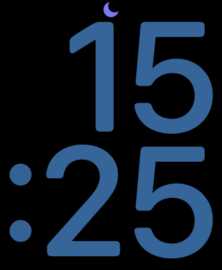
I probably get too annoyed and worked up about this problem with the Apple Watch but the fact that the icon for ”Do Not Disturb” doesn’t follow the accent color of the watch face, resulting in this clash of colors is like nails of a chalkboard to me.
 ©
©
Replies and comments
odd
8 juli, 2021 01:15@MrHenko You too? I don’t have a Apple Watch longer, but I remember this was (to me) a wrong against humanity.
MrHenko
8 juli, 2021 12:09@odd I’m glad to hear that I’m not alone in my frustration. :)